•
Blog

I remember shopping in Kmart circa 1989 with my parents. Narrow dim aisles crammed full of an endless range of product variations. Who would have known muscle shirts were available in so many colors, shapes, and sizes?
I hated going to Kmart.
The only good thing about it was the blue light specials. Retail shopping has happily come a long way since those days. Big bright aisles, easy to navigate store layouts, and logically located products have helped retailers increase their sales per square foot. And then in May, 2001 retail took an even bigger step in its evolution.
The first Apple retail store was opened.
To be clear, it wasn’t an entirely new concept. Apple combined the best concepts of many retailers. The result? Since that first store launched in 2001, Apple has become the king of retail sales, their $4,551 in sales per square foot easily beats every other brick and mortar retail store.
Until Tesla came around.
Elon Musk, CEO of Tesla just recently announced that Tesla’s sales per square foot are now double that of Apple’s. So the question is, what do these companies have in common? A passion for product perfection and an extremely loyal fan base, yes. But the secret to their retail success is not just in their product.
Enter George Blankenship.
He was Chief strategist for Apple’s retail stores and joined Tesla to architect the Tesla retail store experience. Coincidence? Not likely. The similarities between the Apple and Tesla retail experiences are overwhelming. Smiling employees in bright shirts welcome customers into spacious, clean and uncluttered stores filled with natural light.
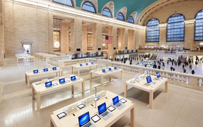
Photo courtesy of Apple.
From the second you walk in, everything focuses on the product. The only thing on the floor in most Tesla stores is a spotless Model S. In Apple stores, even the tables where the products sit are minimalistic, so as not to distract from the beautifully designed iPads and iPhones.
My wife and I recently visited Vancouver and decided to stop by the Tesla store for a peek. Ok granted, Kmart had nothing as cool to sell as Tesla does, but the whole experience is so drastically different from retail of old. Customers arriving at the store are encouraged to experience the product, not just purchase it. 6 year olds are asked if they want to sit in the Tesla’s drivers seat. Next door at the Apple store, retirees are swiping away on iPads.
So let’s get back to the question. What do Apple & Tesla’s retail stores have to do with website design?
Pretty much everything. The reality is, if you’re a service contractor, your website becomes your virtual storefront. And just like in the retail store world, far too many company’s websites still resemble Kmart circa 1989.
But you don’t have to be one of them. You can learn the secrets behind creating more sales per visit, the same secrets that have earned Tesla almost $10,000 per square foot in their retail stores.
Perception
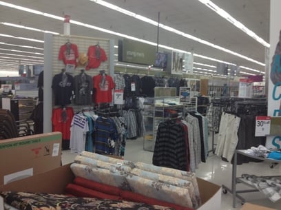
Photo courtesy of Kmartworld.com
Let’s break down the perception factor first. From the first time I walked into a Kmart, I knew that my parents were only here because it was cheap. I had no proof that those shirts would all stretch out of shape in a couple weeks, but everything about the store gave me the perception that it was junk.
What created that perception?
- The only value proposition shown was price.
- The store itself was messy with no attention to detail.
- Store reps were only interested in cashing you out.
In contrast, when you walk into an Apple store, you have the immediate perception that their product is quality, even before you touch it.
- Their value proposition is clear, you’ll love using their product.
- From the second you enter the store, you can see they pay attention to every detail.
- Store reps are trained to help you experience the product, not just buy it.
Do your website visitors perceive you as Apple or Kmart?
Your website needs to clearly convey the value of your product. Hint: Unless you like to lose money, basing your value proposition on being the cheapest is almost always a bad idea. Make your value proposition clear and specific and don’t focus on price.
Don’t neglect the little details on your website. The last 10% of your website should take 90% of your time. It’s the subtle details, often unrecognizable to most, that make up your vistors final impression. In the end, they will perceive your company as either quality or junk.
How do you accomplish this? How does a service contractor help a potential customer experience their product when they don’t have a physical store with a physical product?
Here’s how. Don’t just tell customers you’re the best, show them. Share photos of your work projects making it evident that you do great work and feature genuine reviews. Hint: Don’t just feature reviews, display real photos of the very work you performed to gain each specific review. Place them directly above as many reviews as possible. Doing this truly authenticates your reviews and builds trust. Your visitors will feel that if they choose you, their place will look just as good as the photos, and their final experience will be the exact same as your customers who provided each fabulous review. They’ll have complete confidence that they’ll be happy too. And hey, go even further and feature photos of your team in action with smiling faces. Doing all this, will help your potential customers experience your service even before hiring your company. It will greatly improve your customers perception – of you, your company, and the quality of your work.
Focus
Lets talk about focus next. Remember when retail store aisles were so narrow they barely allowed two customers to pass each other? When you had to stare at a myriad of products on the same shelf trying to pick out the one you were looking for?
Today, most retail stores have aisles wide enough to play Bocce Ball in them. And shelves often have hundreds of the same item on them, making finding things so much easier and more pleasant. They’ve made it easier for you to focus on what you need by cutting out the clutter.
The result: you buy more.
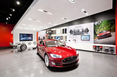
Photo Courtesy of Tesla
In most Tesla Stores, there is only one single item on the floor. The Tesla Model S. Now that’s focus.
Does your website achieve product focus?
Focus doesn’t just happen, it needs to be created.
Our eyes naturally look for pattern disruptions in design. Create a large uninterrupted space and place a product in the middle of it and watch what happens: you will focus on that product. Place too many items in close proximity to each other and our eyes will overlook the entire pattern of objects. Replacing website clutter with uninterrupted spaces will create a better user experience and help your visitors focus on your product, or if you’re a service contractor, your core message.
Carefully crafted headlines help us find what we’re looking for. This is especially important when there’s a significant amount of content on the page. Vague and generalized headlines, or worse, no headline at all, will result in poor focus and frustrated customers.
Tesla could have chosen to show every type of accessory available on their showroom floor. But they knew when to say no (Kmart should have said no to quite a few of those muscle shirts). Featuring every service or product you offer clutters your customers focus. Sometimes the hardest choice to make when building your website (your showroom floor), is to decide what not to highlight. Learn from Apple and Tesla, de-clutter your website and create greater focus on your core message.
Purposeful Design
What about design? You could call the Tesla or Apple stores minimalistic. They’ve purposely stripped out anything that distracts from their product.
Too many website designers are stuck in the vortex of creating design elements for the sake of showing off that they can design something. The result is a myriad of possibly pretty (but albeit useless) design elements, all of which distract from your product.
Design must be purposeful. Designers need to stop and think:
Am I adding a shadow because it’s a cool new thing I learned with CSS? Or because it will create contrast for my call to action, resulting in more click throughs?
Did I add a second column to the design and fill it with stuff because it made my value proposition clearer? Or because lots of other sites have a second column filled with stuff?
Am I redesigning this site because someone said it needed a redesign? Or because I analyzed user behaviour and identified how the design could be updated to improve visitors perception of my company?
Design without purpose is, well, purposeless.
They nailed it.
Apple and Tesla have created not just a location to make purchases, they’ve created a customer experience that drives sales and creates loyal brand advocates. Now it’s your turn to do the same with your website.