•
Blog

Color is everywhere. From the beautiful colors of the leaves throughout the different seasons, to the sky at sunset, to the color of your coffee when you add cream — it’s everywhere! And your website is no different. You may be looking at the design of your website at the moment with the foundations of your layout there, you’ve selected which font to use and now, it’s time to add the color. Color is incredibly special in itself due to how it makes us feel. So, how do you use color in your website to convey trust and to express your values to your customers? In this article, we’re going to discuss:
- Color basics
- Color schemes for your website
- Color psychology and how color impacts your customers
- Tools you can use to find the perfect colors for your website

If at any point, you feel you don’t have the time to design a lead generating website for your home service business, please feel free to reach out to our design team — we’re here and happy to help! And, if you don't have a color for your brand and wonder which color could work well for you, take our color quiz here and find the perfect color for your brand (disclaimer: this is not a scientific quiz!).
“Colours speak all languages.” - Joseph Addison

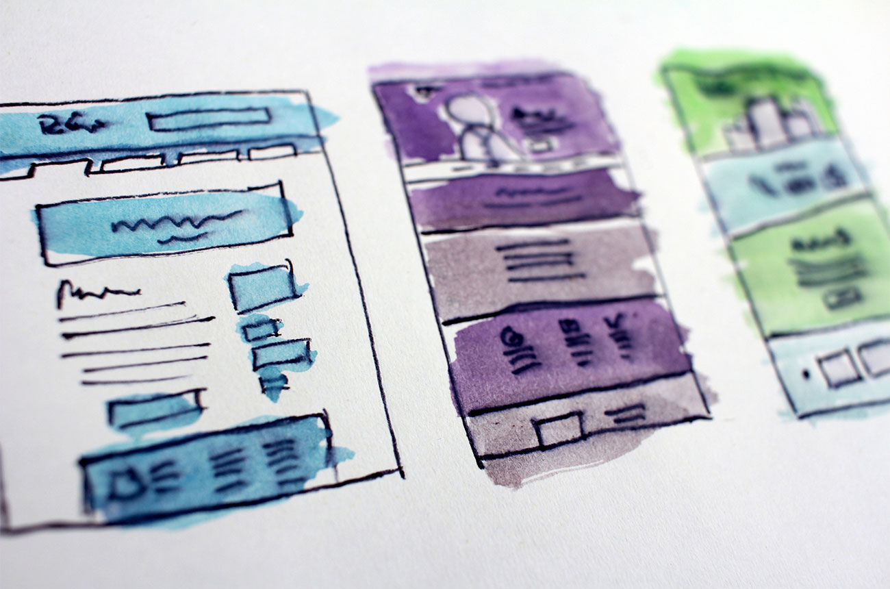
The importance of color in your website design
Color is one of the essential cogs in the wheel of your website design. It allows you to convey certain feelings and emotions to your audience that you may not be able to do through text or imagery. It is another way to express your brand values throughout your website. And, color helps to draw your customers to important elements that you don’t want them to miss, such as your calls to action. Color is your friend! Let it help your home service website thrive.
Color basics
Let’s dive into the basics of color! When you are researching colors for your website, you may see a variety of terms used which you may not be familiar with, or maybe you learned them back in school but just need a good ol’ refresh.
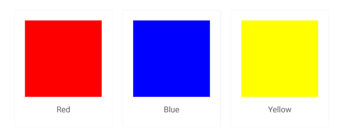
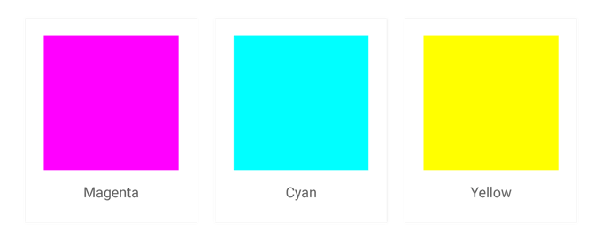
Primary Colors
These three colors form the basis of all other shades of color. They are traditionally seen to be red, blue, and yellow or, in recent years, have been perceived as being magenta, cyan, and yellow.
RGB & HEX
When designing for screens, we use the RGB (red, green, blue) color system. All RGB colors are a combination of the three different color values.
- The RGB color for white: rgb(255, 255, 255)
- The RGB color for black: rgb(0, 0, 0)
The HEX (hexadecimal) color system is commonly used in website design. It is expressed as a six-digit combination of numbers and letters which are defined by our friend RGB.
- The HEX color for white: #ffffff
- The HEX color for black: #000000
Good to know: When researching colors, you may also come across CMYK too. CMYK (cyan, magenta, yellow, black) refers to colored ink and is used for printed materials, not for things on the screen.
Tints & Shades
A tint is when you add white to a color and a shade is when you add black to it.
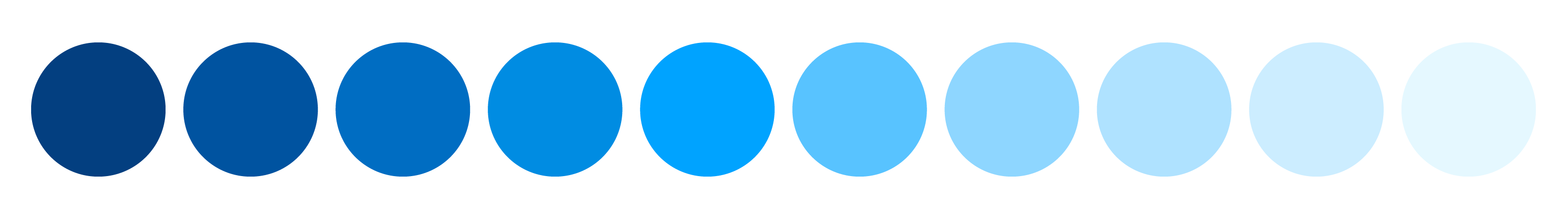
Saturation
Saturation is used to describe the intensity of the color itself. If you increase the amount of saturation in a color, it will make it richer. If you reduce it, it will make it lighter.

Hue
Hue is used when describing how similar or different a color is from the colors of the rainbow (red, orange, yellow, green, blue, indigo, violet).

Color Schemes
There are a lot of considerations for website color schemes for creating websites. We've summarized four kinds of standard color schemes you'll typically come across when looking to pair colors for your website.
Monochrome (or Monochromatic)
Monochrome is a color scheme that is based on one single color tint. It uses shades of a single hue that are made by altering the saturation and brightness of the original base color.


Complementary
A complementary color scheme is based on two colors from the opposite sides of the color wheel. One color is the base color and the other is the opposite of this color on the color wheel.
It is good to take note of the complementary color. It can be used for your call to actions due to the natural contrast it has with your base color.


Analogous
An analogous color scheme uses one base color and two secondary colors that are adjacent to one another. The secondary colors can be used for highlights and accents.


Triadic
A triad consists of three colors which are evenly distributed around the color wheel. This color scheme tends to be more vibrant. If you choose to use any of the colors within the triadic color scheme, don’t forget about the initial meaning of the color (try not to just use the color for the reason that it will really pop!)


The influence color psychology has on your website
Now you’ve got a grasp of the basics of colors, let’s dive into the psychology of color and how this is an important consideration when choosing your website colors. One thing to note is that color psychology is not an exact science. Colors are subjective. They may mean different things to different people and cultures so this is something to consider when selecting your colors as well!

Red
Red expresses strength, passion, energy, and alertness.
When might you use it?
Red might be used for a call to action button to promote action. Depending on the context in which it is used, red can be seen as warm and passionate if used with whites. But it can also be seen as more aggressive when paired with darker colors such as black. It can also be a representation of danger or to stop (think of traffic lights!).
Orange
Orange expresses security, warmth, fun, and energy.
When might you use it?
Similar to red, orange might be used for a call to action button due to how it stands out. If you are a construction company for example, orange may be a color to use to invoke a sense of safety on your website.
Yellow
Yellow expresses warmth and sunshine.
When might you use it?
Yellow is a color which really does stand out but it is one where people may find it quite difficult to look at for long periods of time. So, try not to use it in lots of different areas of your website. Maybe use it as a color for a CTA or if you wanted to highlight a particular section.
Helpful tip: Try to only use yellow as a background color. As a text color, depending on the shade of yellow, it could be quite difficult for your website users to read what it says.
Green
Green expresses health, growth, and well-being.
When might you use it?
Because of the nature association of green, it often resonates as being environmentally-friendly and healthy. So, if you are a carpet cleaning company using organic, natural cleaning products, green may be a color to use on your website!
Blue
Blue expresses trust, intelligence, calm, and efficiency.
When might you use it?
If you have a brand that works well with the color blue, then it is certainly a color to be considered due to its association with trust and efficiency. As blue is associated with water too, it seems to be quite a natural color to use when it comes to a service such as window cleaning.
Helpful tip: If you are using blue, it's important to get the right balance. If used too much, it can start to invoke a sense of coldness or sadness.
Purple
Purple expresses luxury, authenticity, and quality.
When might you use it?
If you would like to express how your service is one of luxury and quality, purple is a color to be considered for sure. It could be used for your call to actions, as image overlays, or even as section backgrounds.
White
White expresses purity, simplicity, clarity, and sophistication.
When might you use it?
Because white contrasts well with many colors, it allows for you to draw attention to certain aspects of your design (e.g. black body text on a white background, call to action buttons etc.). In terms of the tonal connotations, white invokes a sense of cleanliness (great for a cleaning website!).
Black
Black expresses sophistication, efficiency, and substance.
When might you use it?
Black is a staple color when it comes to colors for text, especially when contrasted with a white or lighter background. It can also work well as a background color overlayed on a hero image with an element of transparency if you want to have text on top of an image. This can help to ensure that the text is readable and the image behind is still visible.
It’s certainly important to be aware of the different feelings that colors can emote with your website users. With this information, you must then look at which colors align with your company values and brand to get the best results. Don’t just use a color because you want to invoke a certain feeling or emotion - if it doesn’t align with your company values and your brand, then it may not be the best color choice for your customers.
Helpful color tools to get you started
If you have a set of brand guidelines that reference your brand colors — please do use these as they will ensure that your brand is coherent across all platforms. If you don't yet have a color for your brand, take this color quiz as a starting point to see which color might work well for you!
How do you know what your primary brand color is? A good place to get started is from your logo itself. Look at the main color used there as a starting point and think about what this color conveys about your company. You can use this as your base color.
Next, you can put this base color into a color tool to help find which colors complement it and which colors are analogous. There are various tools out there which you can check out including but not limited to:
Don’t be afraid to experiment! But remember to keep thinking about your audience when selecting your colors too. Once you have selected two or three colors for your website, and you feel confident that they are a good combination, align with your service, vision, and audience, then you can start incorporating them into your website design!
Have some style guidelines, just as you do with your website font to keep your website styles consistent. As a starting point, you could set colors for:
- Your call button
- Your contact button
- Your text link color
- Your call to action background
Be bold, be bright, be colorful!
“Color is a power which directly influences the soul.” - Wassily Kandinsky
Think of your website like a painting. You are starting with a blank canvas and are adding a splash of color because you want to bring about a feeling in your audience when they land on your page. As long as you keep your brand, your vision, and your audience in mind when selecting your website colors, then you’re onto a winner!
And of course, if you don’t have the time to design your home service website, please feel free to reach out to our design team in the blue chat bubble — we are more than happy to help.

*** Main Blog hero photo by Denise Johnson on Unsplash
*** Blog post grid thumbnail photo by Maureen Sgro on Unsplash